



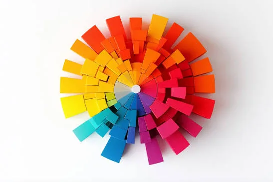
Colors are not just beautiful visual spectra used to decorate designs, but a silent emotional language addressing the consumer's subconscious directly before they read a single word. Studies indicate that nearly ninety percent of initial impressions about a product rely entirely on its colors. Hence, the importance of diving into "color psychology" as a strategic tool rather than a mere passing artistic taste chosen randomly.
Introduction: The Hidden Power of Colors in the Modern Design World
When looking at prominent global brands, you will notice their color choices were not pure coincidence, but based on careful study of target audience emotions. Blue suggests trust and security, making it used by major banks, while red sparks excitement and passion, driving quick decisions like seasonal discount offers.
How Do Colors Speak to Consumer Emotions?
-
Blue (Trust and Security): Grants the user a sense of stability and reassurance, making it the top choice for tech, medical, and banking companies requiring high trust and reliability levels.
-
Red (Energy and Passion): Stimulates heart rates and creates a sense of urgency, which is why it dominates major sale ads and the fast-food sector.
-
Green (Growth and Nature): Associated with health, sustainability, and money, making it ideal for environmental, financial, and natural organic product companies targeting sustainable living.
Frequently Asked Questions
Q: What is the maximum number of colors that should be used in a visual identity? A: It is always recommended to stick to the 60-30-10 rule (60% dominant color, 30% secondary color, and 10% accent color) to avoid visual clutter.
Q: Do color connotations vary across different geographical cultures? A: Yes, absolutely; white, representing purity and clarity in Western cultures, may be associated with death and mourning in some Asian cultures, requiring careful study of the target market.